Brushes at the ready.
Of all the details in a home, paint colour is among the most impactful when it comes to setting the tone. From tranquil eggshell hues to moody swatches of forest green, you can completely transform a space with a simple lick of paint. This past year was a visual feast, with colour trends ranging from zippy shades of pink that instantly uplift, to earthy and oceanic hues that inject a sense of calm.
For 2025, interior experts are already noticing a handful of hues beginning to emerge as clear favourites (more on that ahead). And with the start of a new year, there’s never been a better time to refresh your home with a new palette-cleansing coat of paint.
Below, designers and paint experts make their predictions for the paint colours that will define 2025, and how to achieve the look within your own abode.
Grounded In Nature
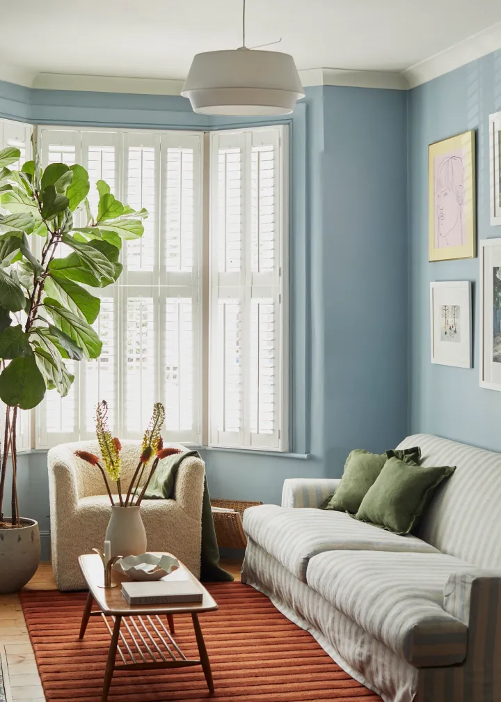
“For 2025, we’re seeing a return to rich, grounding hues that evoke both nature and timeless elegance,” Burcu Garnier says, who is the co-founder of Color Atelier. Among the hues she says are currently trending are earthy greens, soft ochres, and deep, muted blues. “Each of these offer a sense of calm and connection in a fast-paced world,” Garnier notes, adding that Color Atelier’s handcrafted lime washes and natural plasters in these shades “bring warmth and authenticity” to interiors.
The shades you should look out for:
- Olive You - Color Atelier
- Good As Gold - Clare
- Thousand Oceans - Benjamin Moore
Turn to our Olive, Cacao and Lagoon colourways to embrace this trend.
Sweet Treats
Pantone’s color of the year, Mocha Mousse, is already beginning to shape trend predictions for 2025. In a similar spirit, Little Greene’s 2025 colour of the year—Mochi—is a soft, complex neutral that was inspired by the 18th-century neoclassical design of Calke Abbey's dining room. “Rich, warm colours deliver cocooning, restful, and charming spaces,” Creative Director Ruth Mottershead says, noting that they’re perfect for use in all-over colour schemes. “This delightful neutral hue works really well in a colour-drenched room as an alternative to white, grey, or stone.” And due to its gentle and subdued nature, Mottershead deems it a perfect choice for bedrooms, bathrooms, and living rooms.
The shades you should look out for:
- Mochi - Little Greene
- Llama Wool - Sherwin-Williams
- Rue - Portola Paints
Turn to our Hazelnut and Cacao colourways to embrace this trend.
Earthy Jewel Tones
After several seasons of all-white living spaces, the tide is beginning to turn. “Colour is back,” Tina Schnabel says, who is the head of interiors at BarlisWedlick. She nods to jewel tones, but on the earthy side. “The studio is leaning more towards deep eggplant and plums, as it’s warm and comforting but still striking,” she says. “We love how this colour pairs nicely with other colours, like goldenrod yellow and evergreens.”
The shades you should look out for:
- Balloon Ride - Earthborn
- Purple Basil - PPG Paints
- Adeline - Graham & Brown
Turn to our Turmeric, Rust, Cacao, and Olive colourways to embrace this trend.
Deep Taupes
The timeless appeal of taupe lies in both its versatility and comfort-evoking effects. For Eve Taylor (an interior associate at Stonehill Taylor), it’s poised to return in a notable way for 2025. “I think we’ll start to see an indulgence of deep taupes in the new year,” she says. "Tonal plays with saturated neutrals as we look back to nature for inspiration and place an emphasis on handmade pieces, from ceramics to bespoke wood pieces.”
The shades you should look out for:
- London Clay - Farrow & Ball
- Sentimental Reasons - Backdrop
- French Linen - Annie Sloane
Turn to our Oatmeal and Lagoon colourways to embrace this trend.