How I Styled My Bookshelf to Look Like It’s From a Magazine
Much like artwork, bookshelves breathe life into your space.
If you were to ask me what I thought would bring me pleasure as an adult, I’d swear up and down that cleaning and reorganising would be at the very bottom of that list. Growing up with a mother as a neat freak – something I’ve since inherited – I was convinced that “stuff” was bad and that anything more than a framed photo on the wall was a superfluous dust collector that would quickly become the bane of my existence.
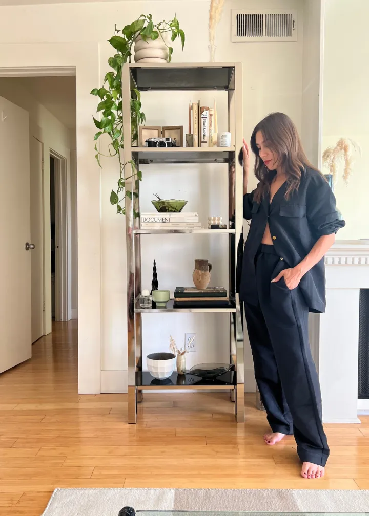
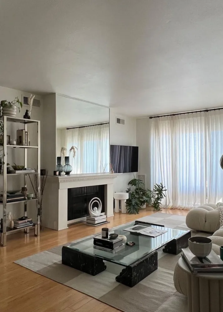
But as someone who loves to collect various books from my travels, vintage candlestick holders, ‘70s-era amber glass ashtrays, and other tchotchkes to keep on display, I quickly found solace in reorganising my vintage Milo Baughman etagere – something I do without fail at least once a month.
Much like artwork, bookshelves breathe life into your space, and when styled correctly, they can be a window into your personality and taste in a way that a couch or a side table just can’t. Even more, they offer a smart, aesthetic-driven storage solution.
Whether you have a set of built-in bookshelves or a stand-alone unit that you can’t figure out how to style, know that there isn’t just one way – and that’s the beauty of it. Ahead, find all the strategies and tips I use to organise my bookshelves without them feeling sterile, or worse, becoming a cluttered eyesore.
Start Big–& Scale Down
While it may seem smart to work from the top-down or bottom-up, I don’t recommend focusing on one area at a time. Unfortunately, that usually results in a bookshelf that feels disconnected and clunky. Instead, I like to start with the biggest, clunkiest items that I have the most of: books. I know you’re not supposed to judge a book by its cover, but in this case, you have my full permission. Now’s the time to decide if you’d rather group your books by the colour of their binding, or if you’d rather keep it a bit less polished. I prefer the latter.
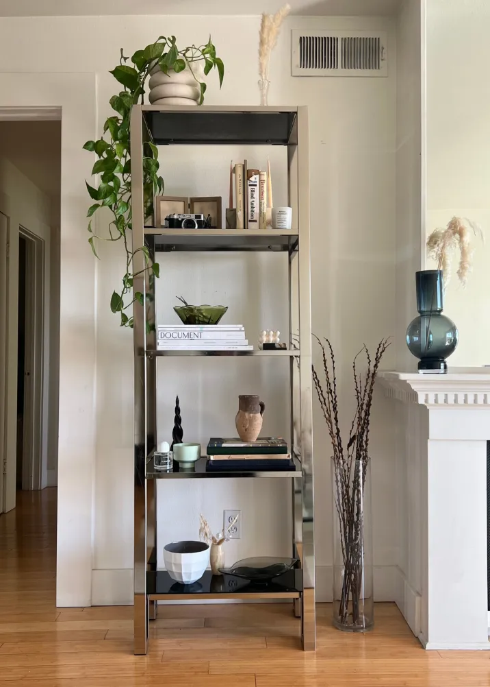
That said, my style is mostly minimalist, and I’m generally drawn to books with neutral bindings. (If I really love a book with a bright binding and don’t want to be bothered to wrap it in parchment paper, I tend to style it backwards, with the book’s pages peering out the front.) I like to stack them in groups depending on their size – and remember to style them both vertically and horizontally.

Show Some Support
While the horizontal books won’t have any trouble staying put, for any vertically arranged books, I continue by finding smaller items like candlestick holders, decorative boxes, and weighty vases to use as makeshift bookends to keep them in place.
I also like to add catch-alls like ashtrays or small bowls atop some book stacks to give them some visual depth. I specifically love the way rounded objects just bowls and ashtrays offer a contrast to rectangular books. Be sure to mix up the overall dimensions of these objects so each shelf feels special but cohesive.
After every new addition, take a step back and observe what it looks like from afar, including the areas that you’re most likely to view it from. This is where you can decide if it looks too symmetrical – or if you didn’t balance colour the way you’d hoped.
Make It Personal
Don’t forget to add in personal touches – and they don’t have to be as blatant as you’d think. For me, it’s a Fuji camera that my partner bought me for Christmas a couple of years back, as well as a bi-fold framed photo of my six-year-old nephew, Xavier.
A few other personalizations that might go unnoticed to the untrained eye include the perfume I wear for special occasions, as well as a bowl filled with the dried rose that my partner gave me on our first Valentine’s Day together. The plant that’s hanging is from a clipping my mother made me for my birthday that I took back to California with me. She ended up repotting it into this planter when she visited earlier this year.

Don’t Go All The Way
That’s to say – you don’t want to fill every single inch of space that you have with books, knickknacks, and other items, lest you want it to feel too crowded. Instead, let some negative space shine through. This is especially true if your shelving is open and you have a fun paint colour on the walls.
Once you’re done, take a final step back for any small adjustments. Try not to get married to any single vignette, but remember: It’s just a bookshelf.
Shop the Style
Enjoyed This?
Here's some more advice on upgrading your home decor.


